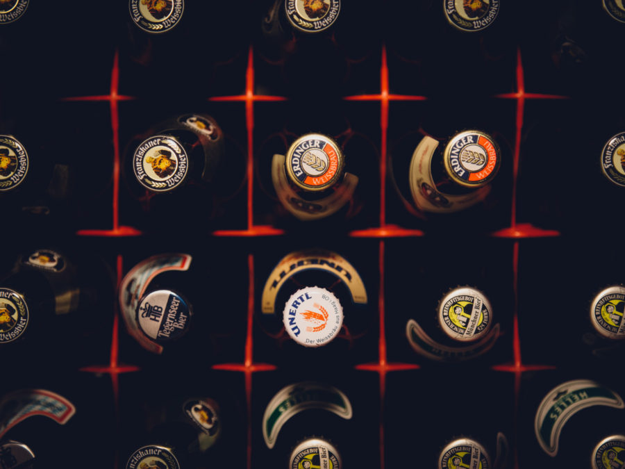
There’s nothing quite like relaxing with a cold brew after a long day at work. But like many designers, we’re just as interested in beer packaging as we are in the flavor of the beer. There’s no point in drinking out of an ugly bottle when you can be a connoisseur of both creative packaging and fine brews, right? After all, the labels and designs on the tap handles, cans and bottles themselves are an unorthodox display of modern art illustrating the boozy potion inside.
 Craft beer companies are popping up at an alarming rate, so how do they stand out? Harvery Shepard, designer and author of Oh Beautiful Beer, a book dedicated solely to the art of beer design, from labels to cans and bottles, says “Packaging is often the first way a consumer interacts with a brand.” He continues, “With the craft beer explosion, shelves are getting increasingly competitive. Design is often the reason that a beer gets off the shelf and into a consumer’s hand.”
Ten years ago, a lot of breweries found they could get away with soliciting a friend to design their beer packaging. Not anymore. With so many beers competing for attention on the shelves, standout beer labels have become a critical part of any brewery’s marketing strategy. Beer companies are now hiring well-known artists to design concepts for their packaging. Brooklyn Brewery noticed this need long ago, hiring famed graphic designer Milton Glaser to design their now iconic beer brand logo.
At their worst, craft beer labels can be confusing and thoughtlessly attention-grabbing, colorful collages splayed onto a bottle with amateur skill. But at their best, they’re thoughtful and thought-provoking, catchy and beautiful — eloquent and imaginative translations of the complex liquids inside the can or bottle. And as craft beer becomes more paradigm than upstart, beer labeling and design has morphed into one of the main sources of and venues for its inspiration and creativity.

Take, for example, the ever-crowded beer selection at your local grocery store. It can feel pretty intimidating. As a consumer, odds are that you’ve probably never heard of, let alone tasted, over 70% of the beers looking back at you. But this lack of bias is exactly what makes good branding all the more essential. One brewer who we’ve seen take this insight to heart is Uinta, a Utah-based craft brewer. With just one look at their packaging, one feels the vibe that the brewery offers its consumers. Bold, illustrative imagery of the great outdoors makes me picture fun activities such as hiking, fishing or camping during which Uinta would be most enjoyed. But what truly separates Uinta from other competing beer brands is its portfolio, which offers a consistent visual brand voice while never losing sight of each beer’s individual story.
 Even places like Florida (our headquarters) are seeing a renaissance in craft breweries. There are now over 150 establishments in the state of Florida creating beer on premises. Dave Butler, the creator of Florida Beer Blog, extensively tours and documents the state’s burgeoning beer scene, and he has witnessed the importance of design in a brewery’s success. “If you look back just 5 years ago, there just wasn’t a lot of Florida Beer on store shelves. Now, it’s everywhere. And I think Florida breweries will continue to see the importance of making sure their product stands out and is easily identifiable as classic Florida.”
It is critical and meaningful for the labels and design to show and tell the interesting stories behind the brews, the stories that connect to consumers. People purchase and consume to that which they connect. This is how, with a rags-to-riches tale, Sam Adams made a name for itself, and continues to grow.
Gerard Walen, author of ‘Florida Breweries‘ (Stackpole Books, April 2014) and the man behind Beer in Florida, stresses the point of design, specifically for locality, saying “Craft beer got its start by telling the stories behind the brews. It is important to share on the packaging where the beer is from and how it got its start.”
Just like the craft beer business, labeling art and design have experienced massive changes in the past several years. Design has more effect on the end product than most drinkers realize; more and more, the design side of craft beer is influencing brewers and breweries, leading the beer’s style and intent at an early stage rather than the other way around. The design behind beer is significantly less understood, but from bottles to caps, is becoming increasingly more integral in the overall product, as well as the public’s preference. This is why Magic Hat continues to produce funny tidbits of text on the underside of their beer caps, why Flying Dog continues to use Ralph Steadman’s outlandish art on their bottles, and why big names like Coors is starting to redesign labels and tell their “humble” origin story.
Cheers!
Homework: Canvass your friends and ask them how much do their favorite beers correspond to their favorite labelling. We would love to hear what you think on Facebook.
