
There comes a point in every design project where you have pushed past the initial concepts and it is time to think about the design. However, before you dive in, you should pause and consider the finished product, because it is at this early stage where you take your design from basic to bananas by knowing how premiumization works.
Premiumization, in the context of printing, is used to describe any ‘extras’ done during the print process and plays a significant role in the perceived value of a piece. It can impart character and make a piece feel expensive, playful, premium or unexpected.
In my early career, considering these extras felt unnecessary. With tight budgets, I thought I could achieve my goal of turning a digital design into a printed piece without them. But what I was missing was the notion of how these added costs could heighten the effectiveness of my work and better achieve the clients’ goals. It was only when I started to consider these premium options that I realized what I had been missing in my projects was everything.
Let’s Go
What Are My Options
There are a number of premium add-ons that can be achieved during your print job, including:
- Die Cuts
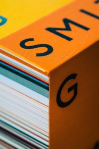
- Premium Papers (Textured, Super Smooth, Recycled, Colored)
- Embossing / Debossing
- Specialty Inks (Pantone, Neon, Glow in the Dark)
- Foils (Metallic, Holographic, Shiny, Matte)
- Coatings (Matte, Gloss, Spot Gloss, Soft Touch)
Each of these can have a powerful effect on the finished product when executed purposefully and thoughtfully.
Run Don’t Walk
Where to Start
Premiumization provides you the opportunity to make something extra special. And not just special for the sake of it, but special in a way that speaks to the brand and supports its message.
 Start with an idea of what the brand is trying to achieve with the piece and then look at how you can use premiumization to get there. Order paper samples, foil books and talk to your printer to see what they recommend. Check out their competition and get inspiration from sites like The Die Line, Pinterest, or Behance. It takes some time to understand how each of these options can play up your design and make you stand out. A few ideas could be:
- Combine heavyweight paper with a spot-colored ink – Perhaps you find a light shade of pink paper in a cover weight and apply a Pantone ink to create a strong contrast between the paper and ink. By not using CMYK to create color you will get more solid ink coverage and be able to achieve colors that are not otherwise possible.
- Select a non-traditional foil color to add some shine – Foil is available in a full spectrum of colors, not simply your standard silver and gold. Perhaps you choose a matte green foil to accentuate small details on a health food package and accentuate its unique characteristics from the rest of the design.
- Blind deboss for the subtle wink – You can choose to deboss a logo into your paper and not print any ink in that area, making the effect of debossing a little more subtle. While the treatment may be less obvious, the impression it leaves with the viewer is anything but, because when the consumer spots it, they get it.
- Spot gloss in the right places – Spot gloss or varnish as it is sometimes called is a tried and true trick in many designers’ repertoire. Imagine a soft matte package in your hand and then as you slowly move it around you notice design elements shining off of the surface. What is that? That’s the spot gloss shining in specific areas, drawing your attention to all the right places. It’s an inexpensive extra that works.
- Die-cut to remove what you want people to see – Thinking about die-cuts means considering the negative space. It is addition by subtraction. Anytime you cut something out of your piece, it becomes more note-worthy. Think about a brochure where a piece has been cut out of the cover to show a pop of color on the page under it, or a business card cut to the shape of a carnival ticket.
Slow and Steady
Detours, Not Roadblocks
When approaching these costs with a client, help them to understand the added benefits, show them examples of what you are thinking. Have them consider the additional cost per piece rather than the additional lump sum.
When getting quotes, having a larger order also helps to keep costs down so ask for a range of quantities to see where the greatest price break is.
Shop around, get multiple quotes and talk to printers about your budget to see what they can recommend. Sometimes they will have extra inventory of paper they are willing to let go of for a discounted price.