Branding
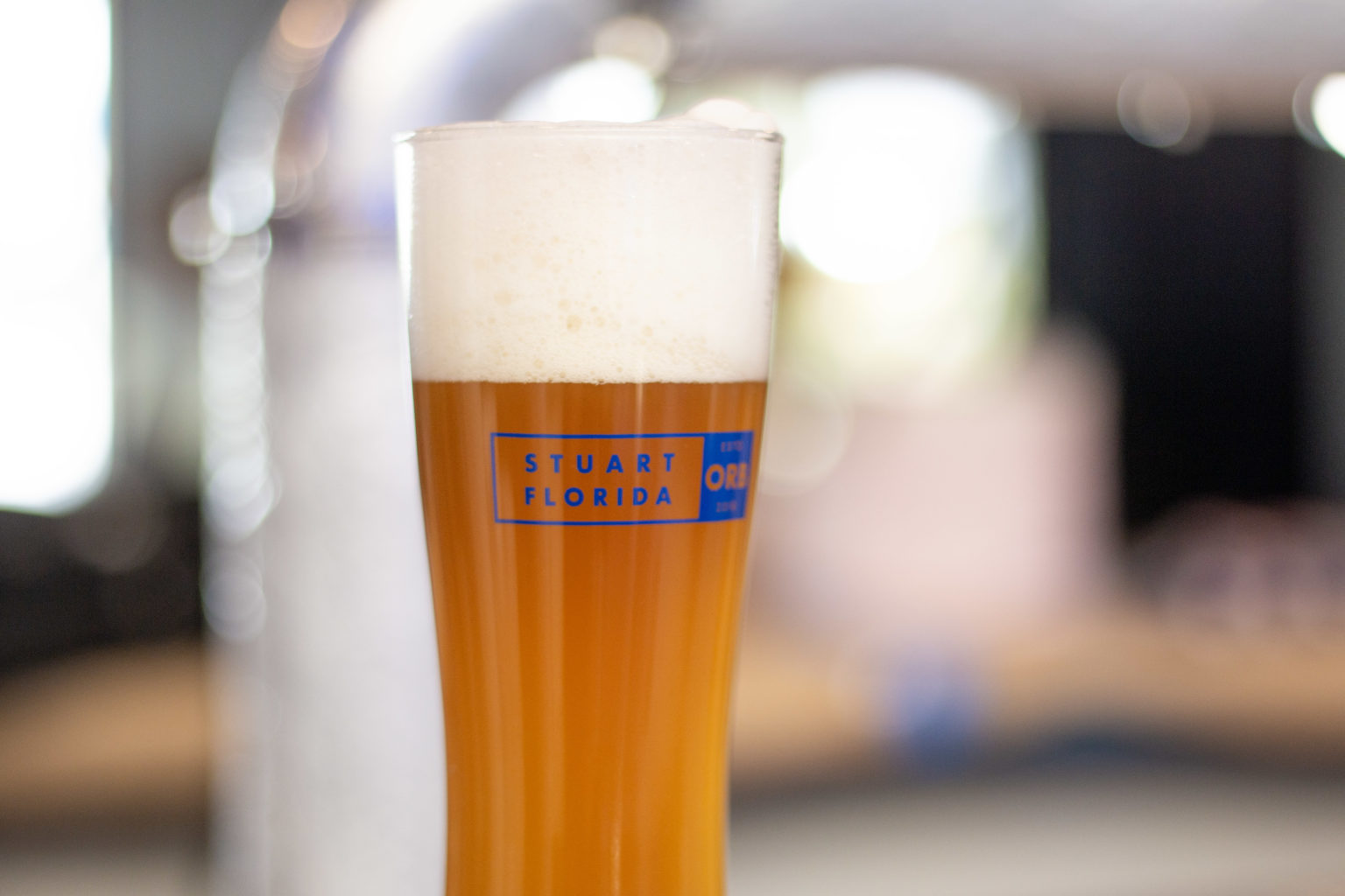
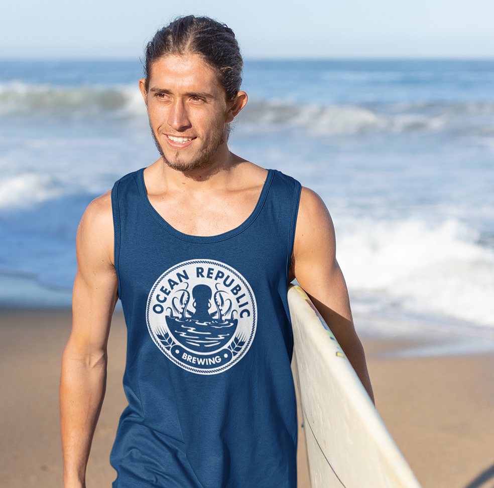
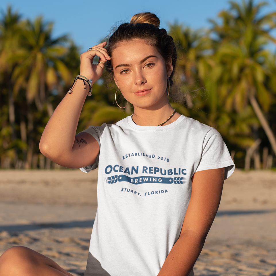
When developing the Ocean Republic Brewing brand, it was important to keep in mind the location of the brewery and its ideal audience of locals. The Florida shore inspired color palette and fun type styles represent Stuart’s scene of beachgoers, water sport enthusiasts and young families. The bright, cheerful branding invites people from all walks of life into the brewery to sit down, relax and enjoy the locally brewed beer and handcrafted food.
Logo Design
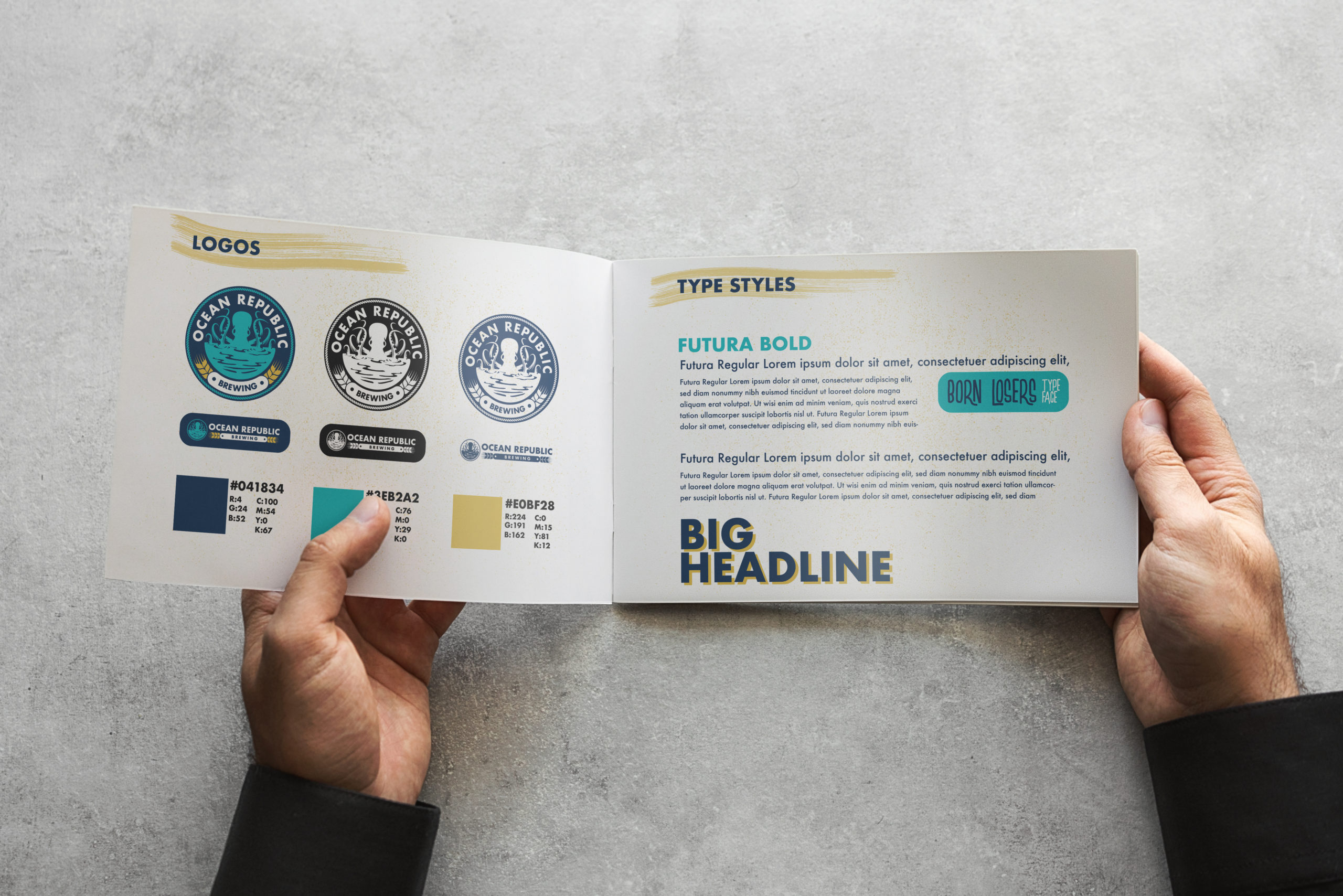
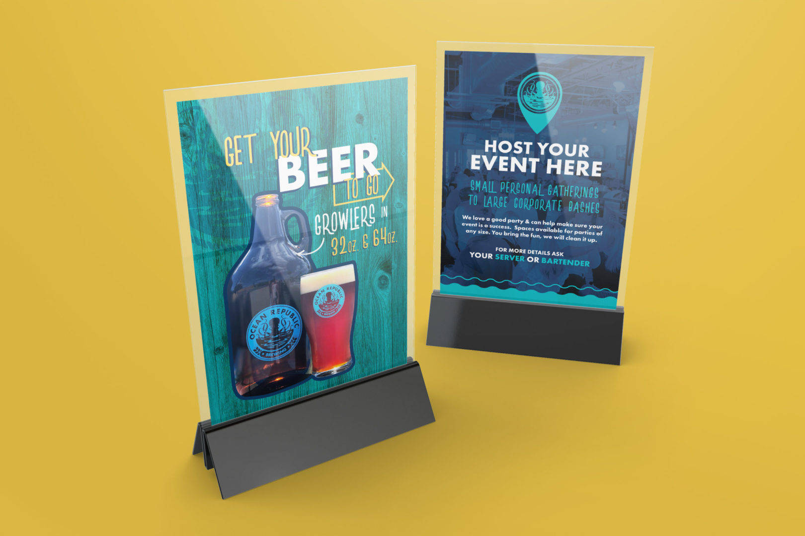
Embracing the rich nautical history of the area, an octopus made a perfect iconic pairing to the brewery—
its unique shape is impactful and even a little whimsical.
Website
Staying true to the brand, the website depicts an easygoing Florida lifestyle with a cheerful tone and vivid photography. We prioritized ORB’s housemade on-tap selections which are live-updated through their partner API and presenting up to date food menus so that viewers can easily get a taste of their offerings.
Social
Starting from zero, we organically grew Ocean Republic’s social presence with a teaser campaign to introduce the brewery, followed by a strategic selection of tasty food and beer features, behind-the-scenes “brewery life” photos and customer imagery. Staying consistent and engaging with their local following, we grew their following within a couple of months to over 2,500 and continue to see their engagement increase.
Refreshing Beers
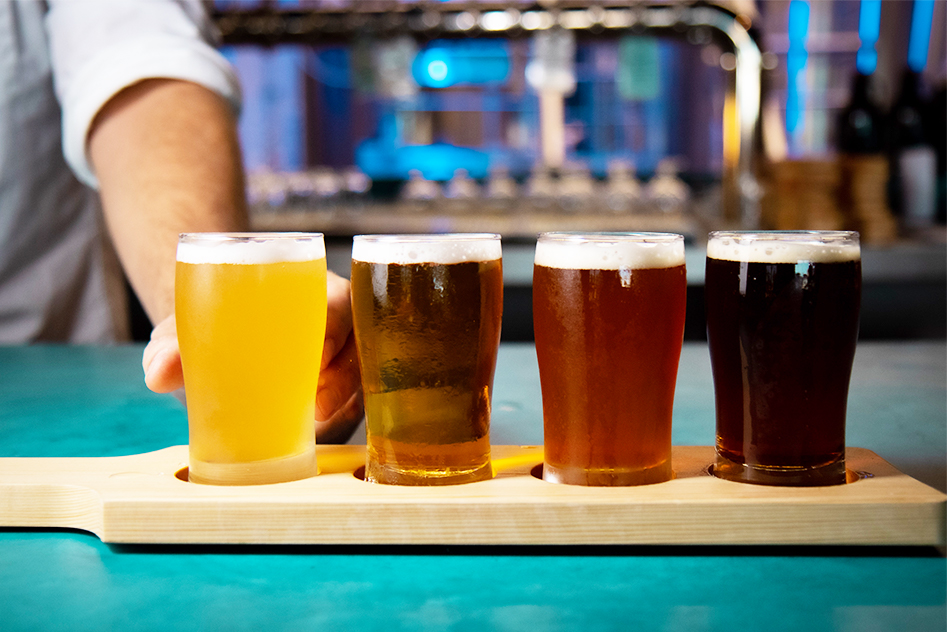
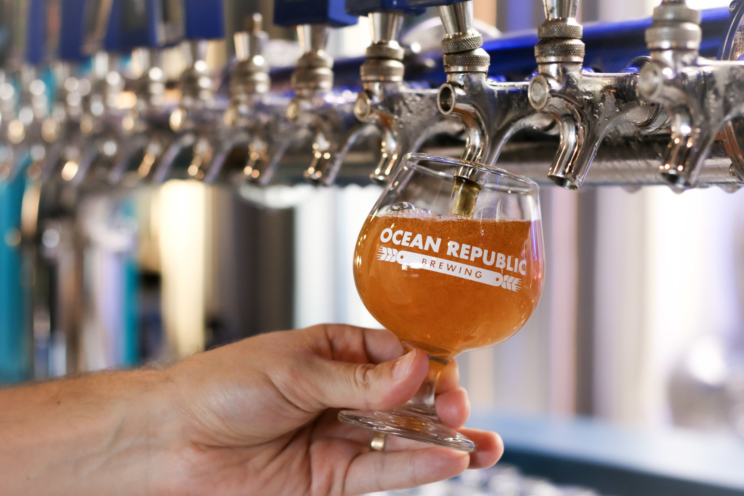
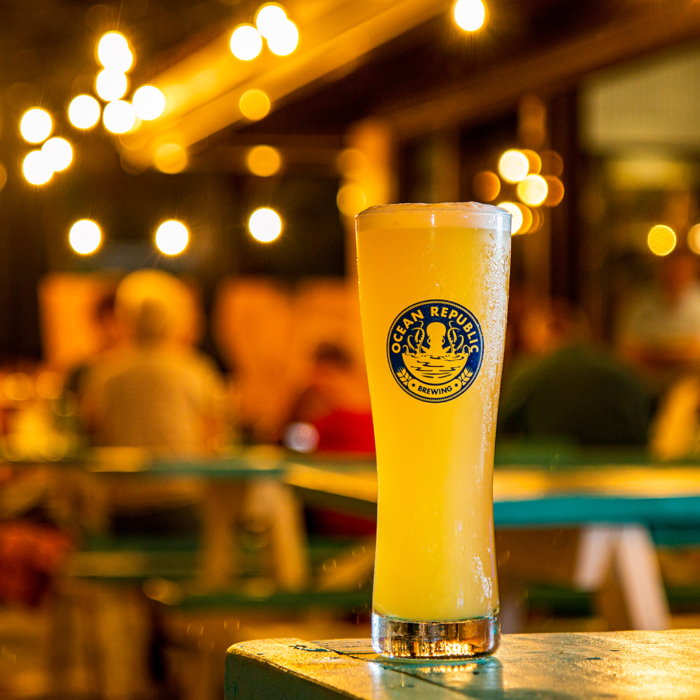
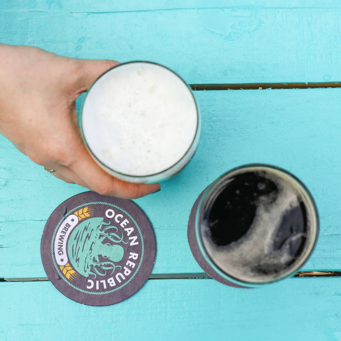
Ocean Republic Brewing started as a humble home brewing project, and the adventurous approach to brewing has remained. In addition to the core beers, ORB also offers two seasonal taps and two rotating treatment beers. Their customers crave variety, and the brewery is able to provide enough choices for any beer lover’s palate. The tap handles feature the octopus logo with a space for the beer variety, ensuring consistency and readability down the entire line of tap handles.
Delectable Menu
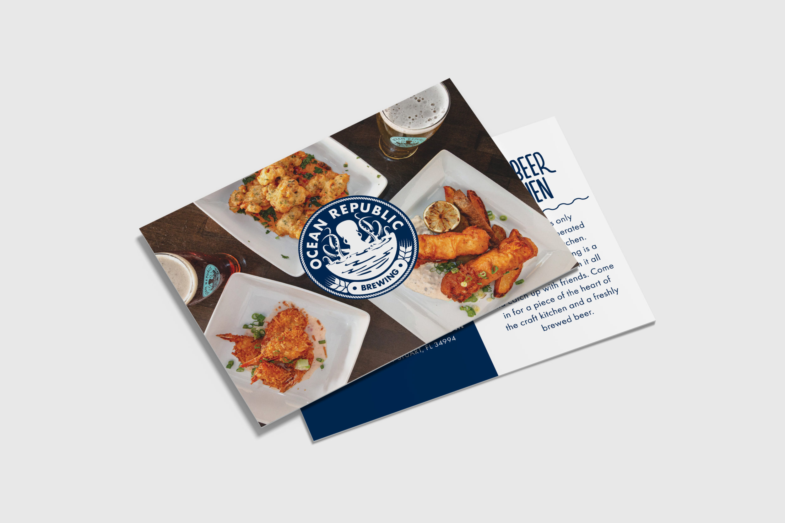
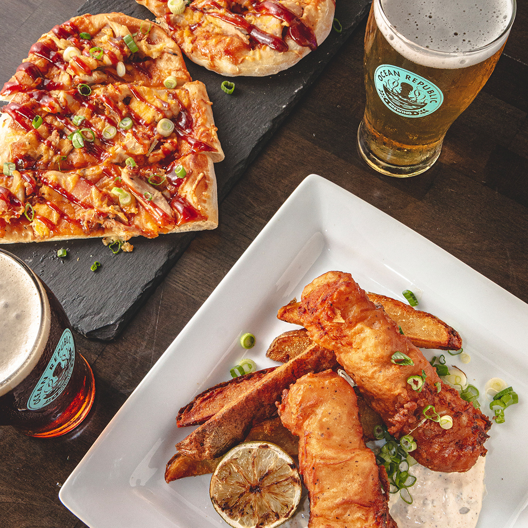
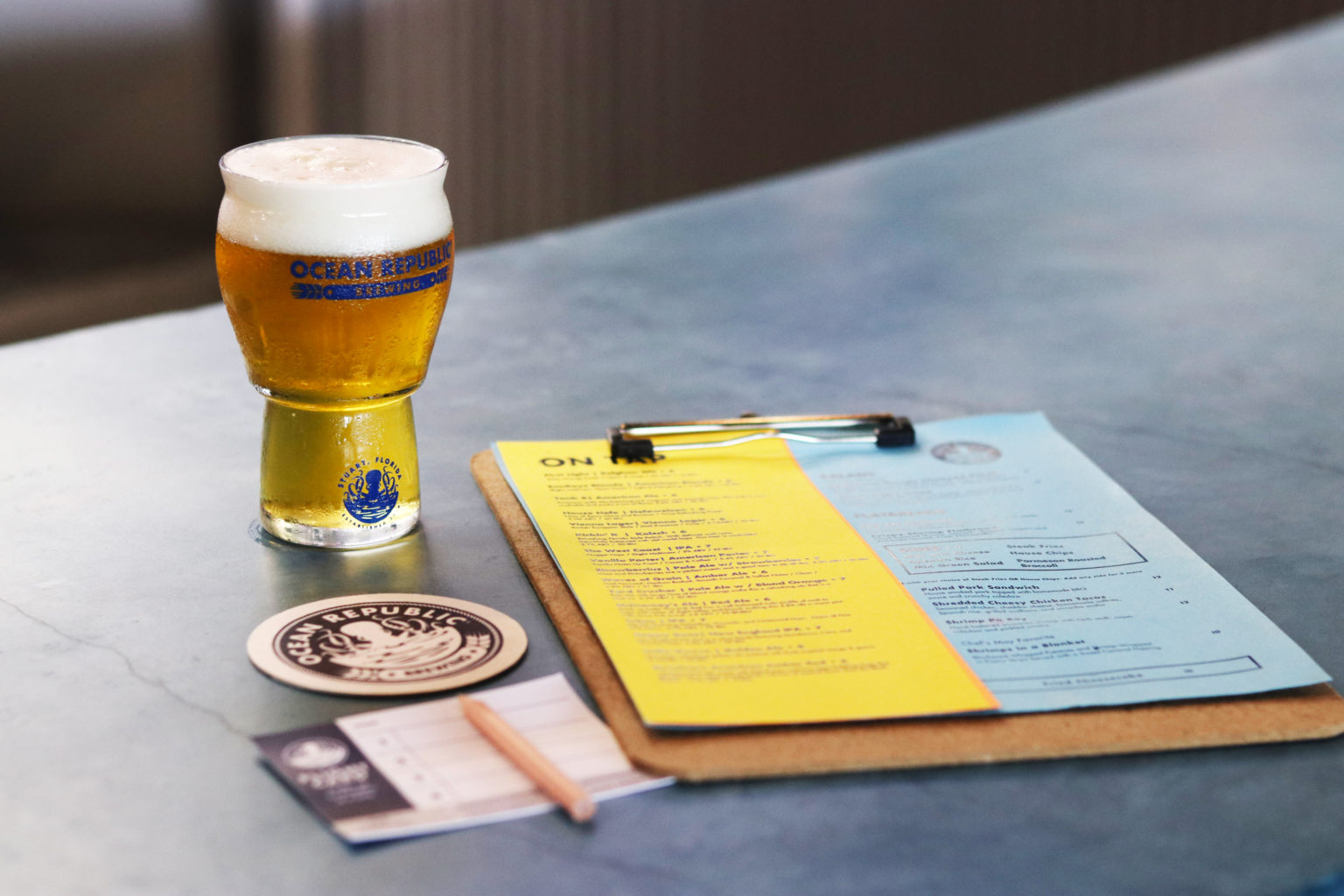
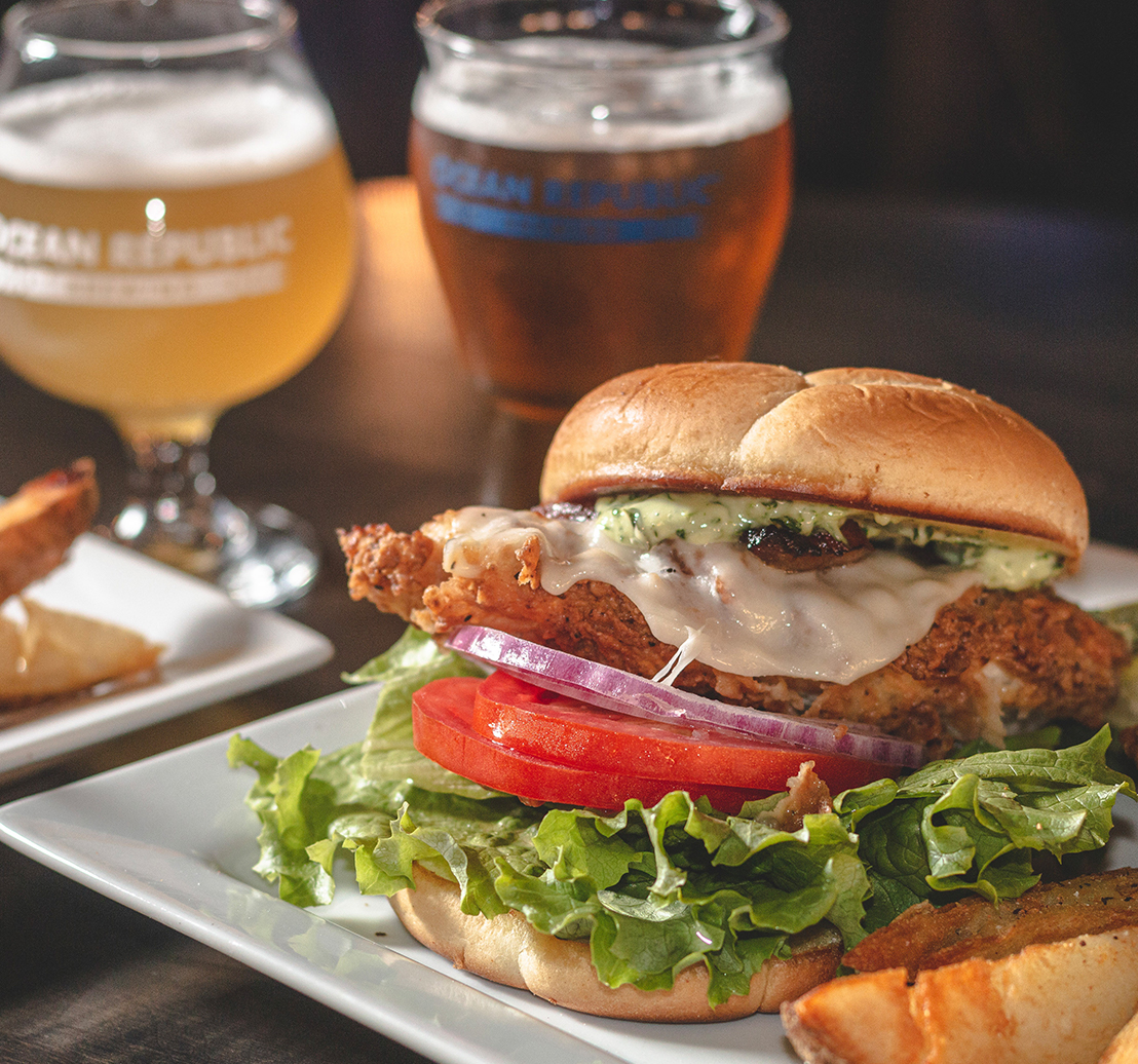
What makes Ocean Republic Brewing unique is their extensive menu of appetizers, flatbreads, and entrees. The menu was carefully crafted to pair well with their tasty beers. With such a large selection of options, we prioritized organization and grouping the offerings in a logical way so customers could dig into all the options available.
Beer Labels
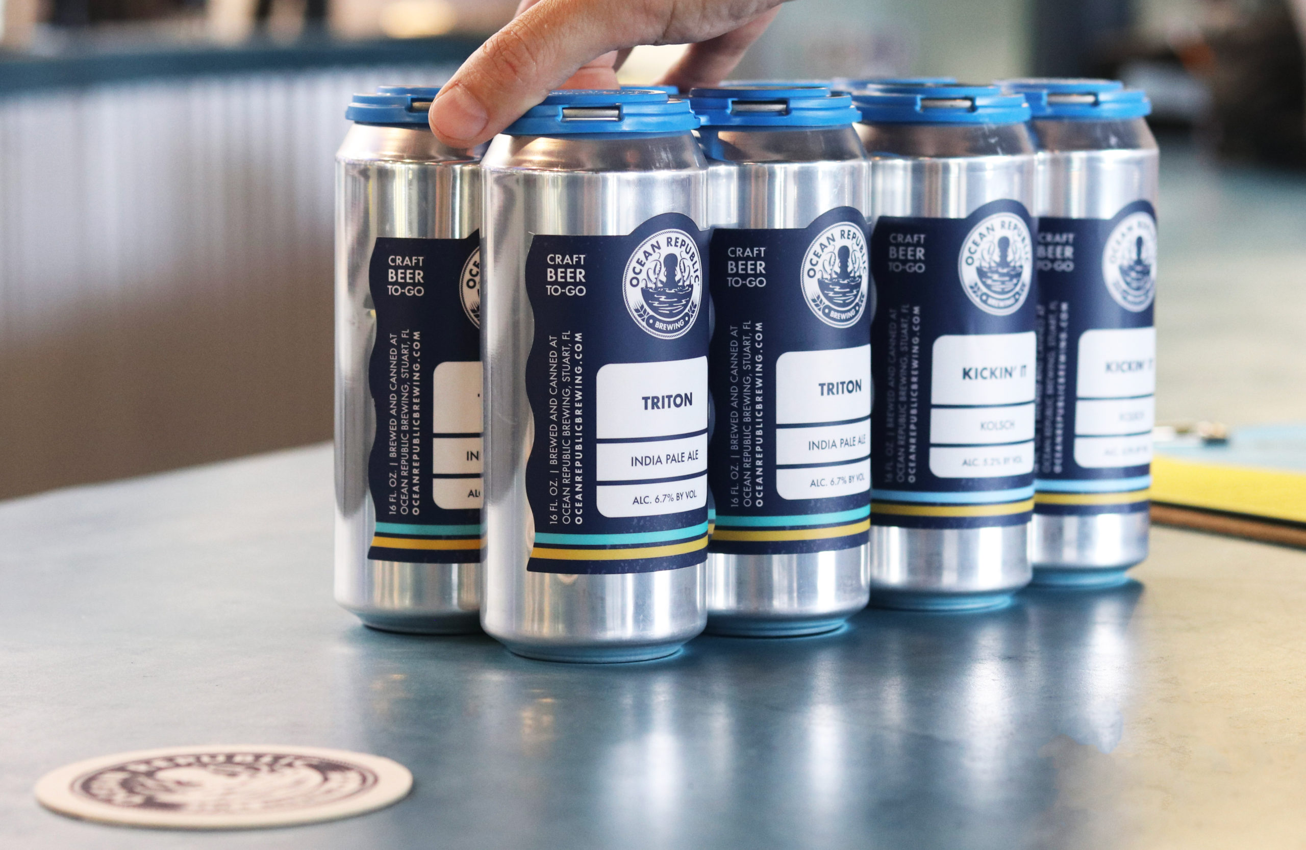
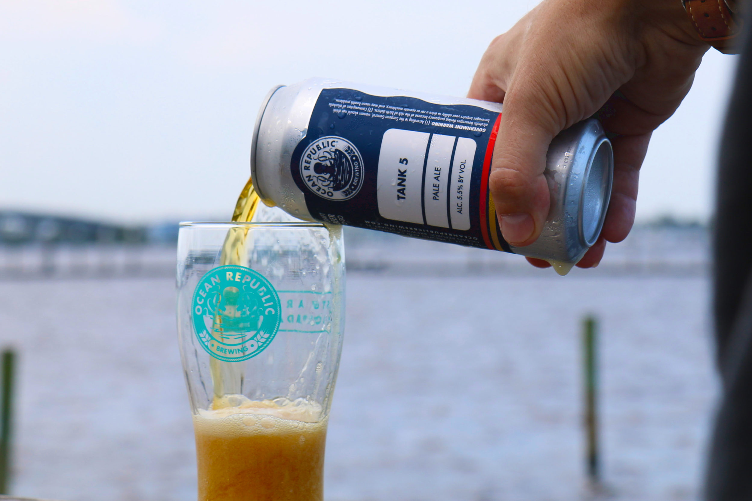
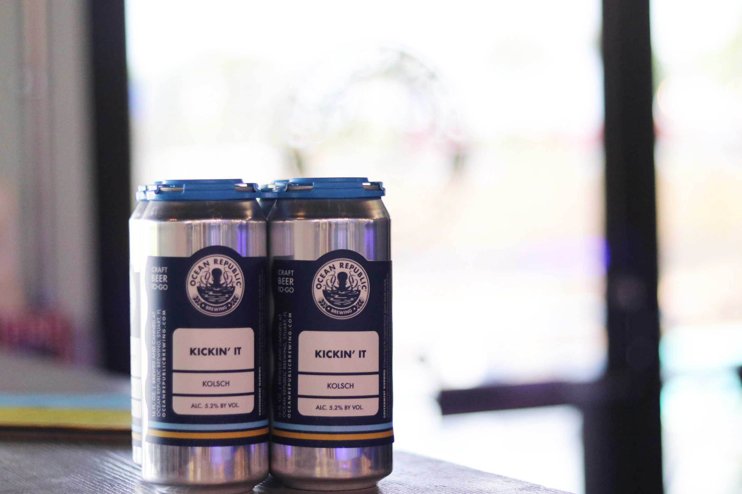
When designing their crowler labels, we wanted it to be unique and easy to distinguish when grabbing from their to-go fridge. The one-of-a-kind die cut represents their ocean-minded, beach-inspired brand. We added colored stripes to the bottom of the packaging to indicate the different styles of beer, making it a quick process for a grab-n-go.
Flight Cards
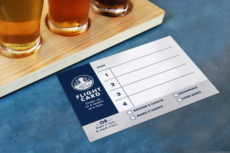
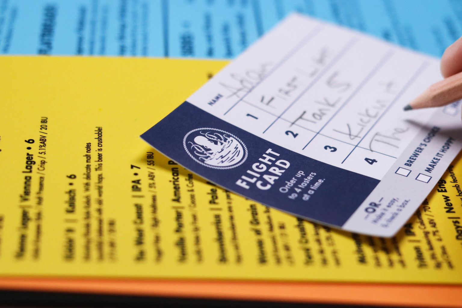
While selecting a beer for a flight can be tricky, we wanted the process to be smooth as possible for the customer. As a personal touch, we added a checkbox to let the customer throw caution to the wind and let the brewery choose the entire beer flight. We added this option to open a conversation between bartender and guests, and as an opportunity for visitors to get a taste of what the brewer would recommend.
